Store design
Keep your store colours consistent with colour schemes
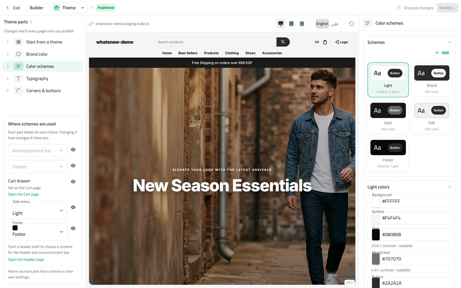
Set your colours once on the Theme page and reuse them across the header, sections, cart and footer. The builder warns you if text is hard to read.
- Where
- Design › Theme
- Used by
- Header, home sections, cart, side menu, footer
- Safety
- Warns when text is hard to read
A store with a few well-matched colours looks more trustworthy. Colour schemes let you set those colours once and use them everywhere, so you never pick colours section by section again.
What changed
The Theme page in the builder brings your store’s look together: Start from a theme, Brand color, Color schemes, Typography and Corners & buttons. A scheme is a set of background, text and button colours. Each part of your store picks a scheme, and the builder shows where each scheme is used.
When text and background are too close, the builder tells you, so your store stays easy to read. There is also a new light Azure preset that suits electronics stores.
How to use it
In the builder, choose Theme and open Color schemes. Edit a scheme’s colours and watch the preview.
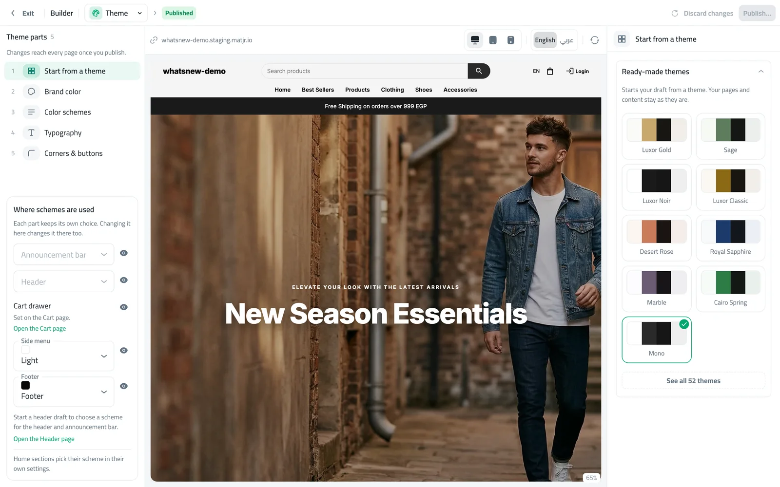
Or open Start from a theme to apply a ready-made set of colours, then publish.
Frequently asked questions
If I change a scheme, what updates?
Every part of your store that uses that scheme updates together after you publish.
Did my current colours change?
No. Your existing colours were turned into schemes, so your store looks the same.
Can a single section use different colours?
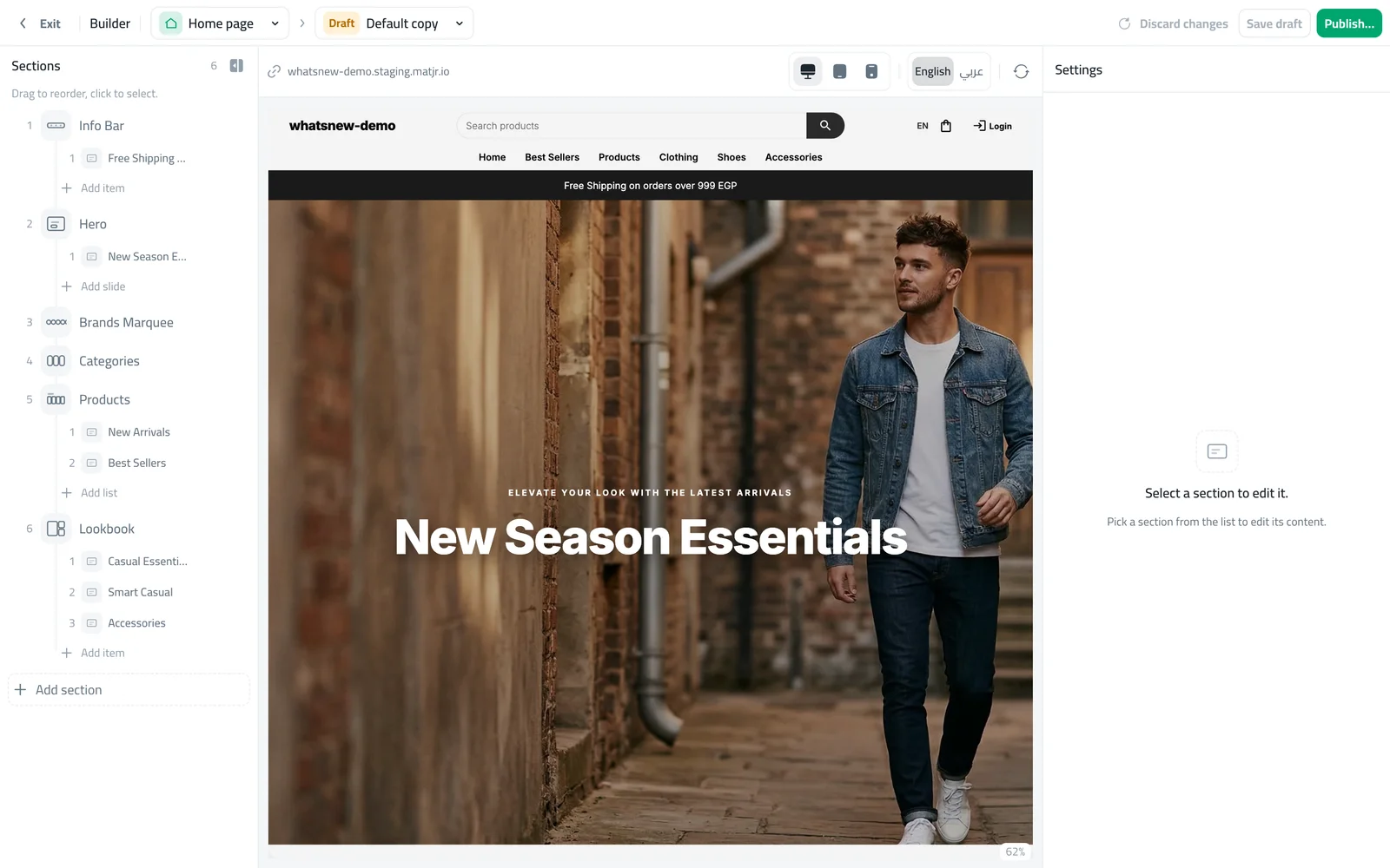
Yes. Each home section can pick its own scheme in its settings.
Try it on your own store
Start your free trial. No credit card required.