Mağaza tasarımı
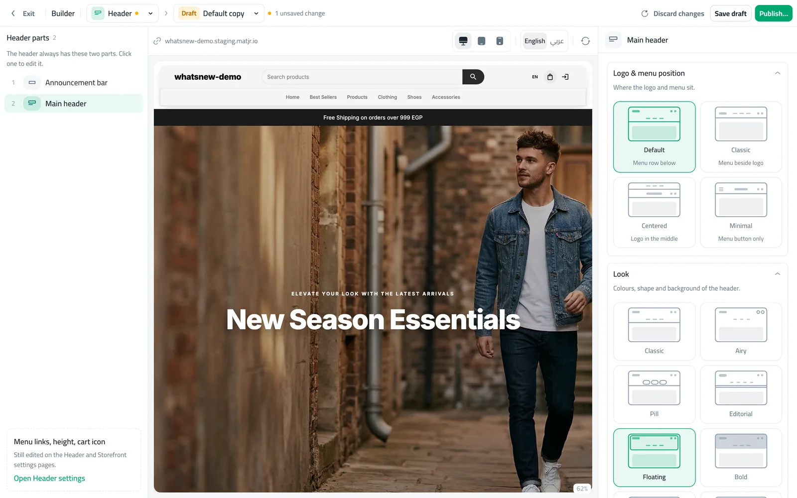
A header that fits your brand, with 19 styles to choose from
Pick a header style, keep it fixed while shoppers scroll, add a large menu, and give phone shoppers an app-style bottom bar.
- Where
- Design › Header
- Styles
- 19
- Extras
- Sticky header, mega menu, phone tab bar
The header is on every page of your store, so it shapes the first impression. You can now give it a style that suits your brand and make it easier to shop on phones.
What changed
The Header page in the builder has 19 styles, from Classic and Airy to Floating, Glass and Wordmark. You can choose where the logo and menu sit, and add these extras:
- Sticky header keeps the header at the top while shoppers scroll.
- Mega menu shows big drop-down panels for menu items with sub-links, on computers.
- Phone tab bar pins Home, Categories, Cart and Account to the bottom of the screen on phones and tablets.
How to use it
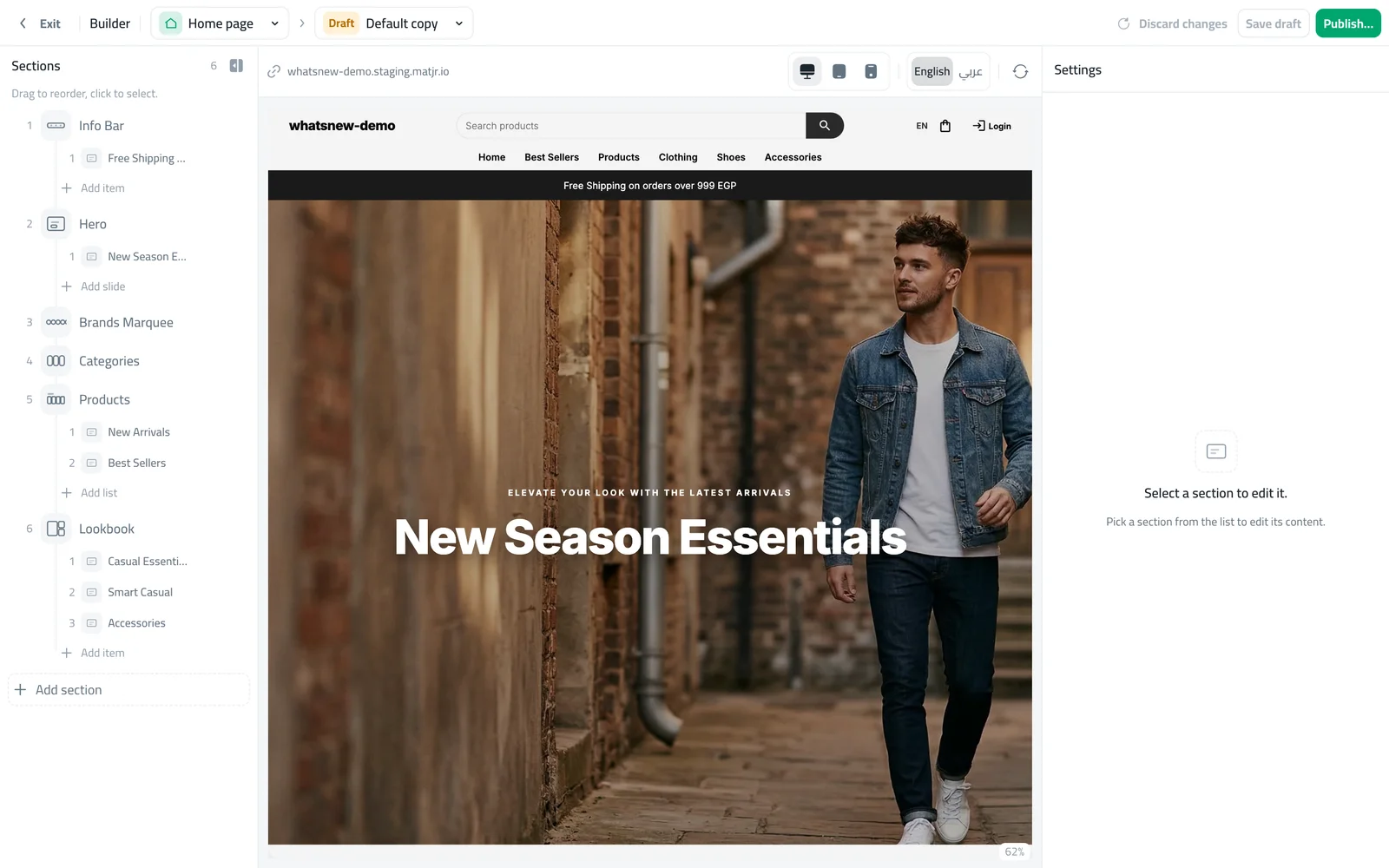
In the builder, choose Header and start a draft from your live header.
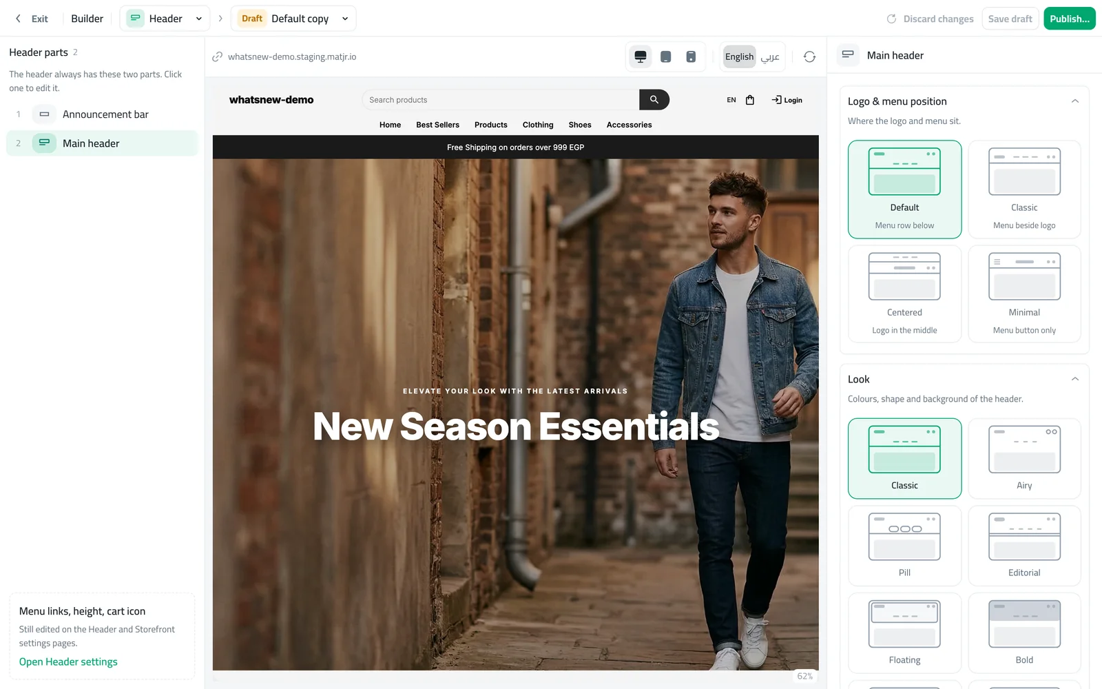
Click a style and turn on the extras you want. Check the phone preview, then publish.
Good to know
- The header colours follow the colour scheme you choose for it on the Theme page.
Sık sorulan sorular
Will my menu links change?
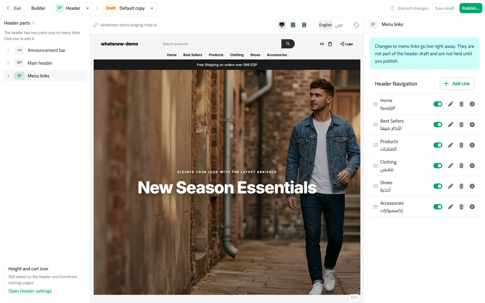
No. The header style only changes the look. Your menu stays the same.
Does the phone tab bar replace the menu?
No. It adds quick buttons at the bottom of the screen. The menu is still there.
Can I try a style without changing my store?
Yes. Work in a draft and publish only when you are happy.
Kendi mağazanızda deneyin
Ücretsiz denemeyi başlatın. Kredi kartı gerekmez.