Store design
How to design your online store with the builder
How to design your online store step by step: pick pages, add home sections, style the header, product page and cart, and set your colours.
- Where
- Storefront Design › Design
- Time needed
- About an hour for a first design
- Pages
- Theme, home page, header, product page, cart
If you are wondering how to design your online store without hiring a designer, the builder is where it all happens. You see your real store while you edit, you work in drafts, and shoppers see nothing until you publish. This walk-through covers the whole job, from planning to publishing.
Before you start
A good design starts with a little preparation. Ten minutes here saves an hour of trial and error later.
- Your logo, ideally on a transparent background.
- Two or three brand colours. One main colour for buttons and one or two quiet colours for backgrounds.
- A few strong photos for the top of your home page. Wide photos work best on computers. Check how they crop on a phone.
- Your best products and categories, already added with clear photos and prices.
How to design your online store, page by page
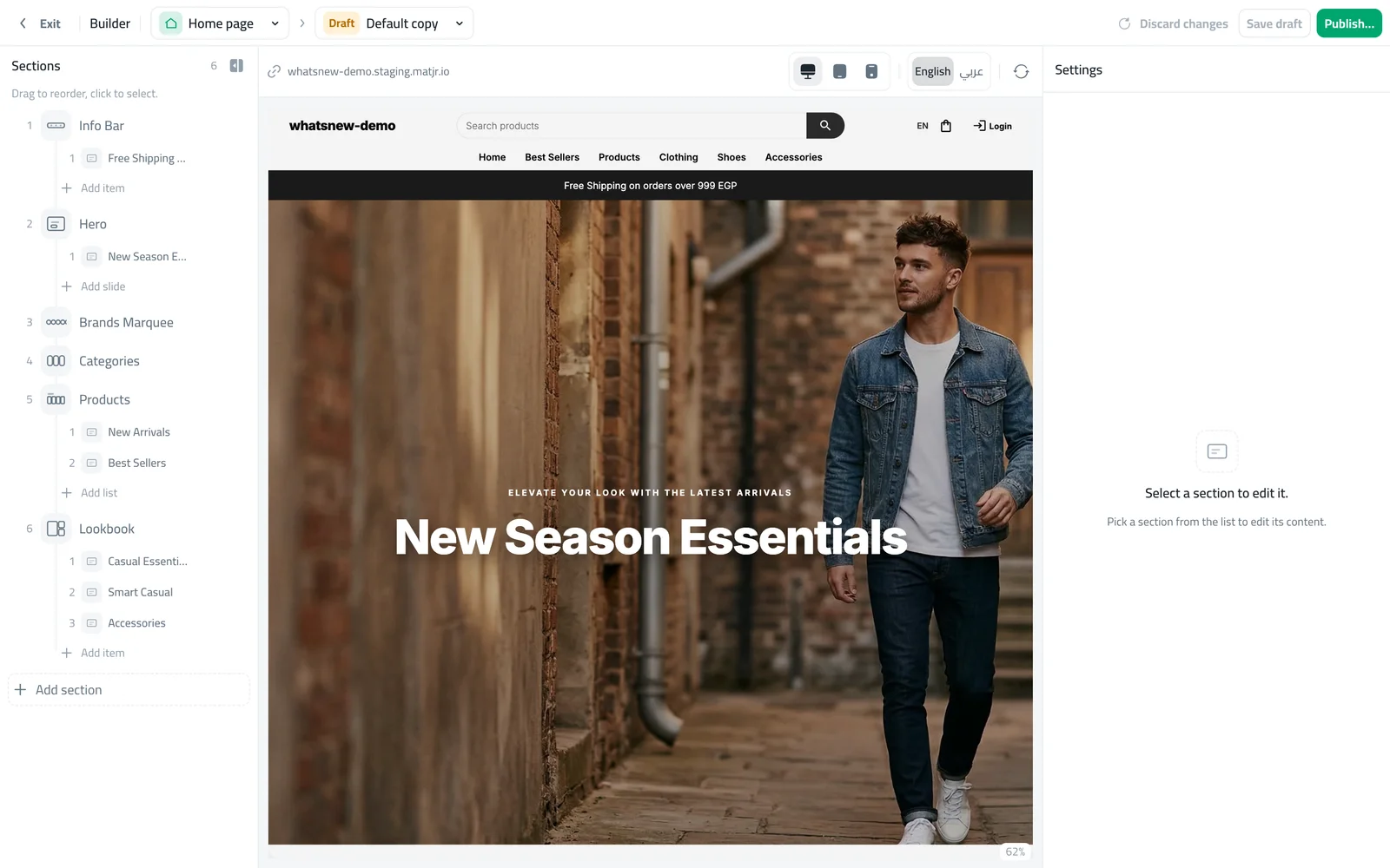
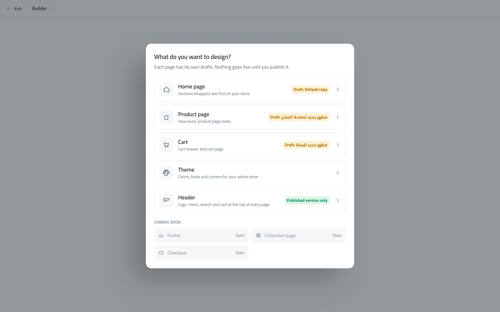
Open Storefront Design in your dashboard and click Design. The builder opens full screen and asks what you want to design. Each page has its own drafts, so you can work on one page at a time.
Choose a page. Start with the Theme so your colours are right, then move to the Home page.
Start a draft from your live page. The middle of the screen shows your store, the left lists the sections and the right shows the settings.
Set your colours and fonts first
On the Theme page, pick a ready-made theme or set your Brand color. Then open Color schemes. A scheme is a set of background, text and button colours. Your header, home sections, cart and footer each pick a scheme, so when you change a scheme, every part that uses it changes together. If text becomes hard to read on its background, the builder warns you.
Open Theme and review each scheme. Change a colour and watch the preview update.
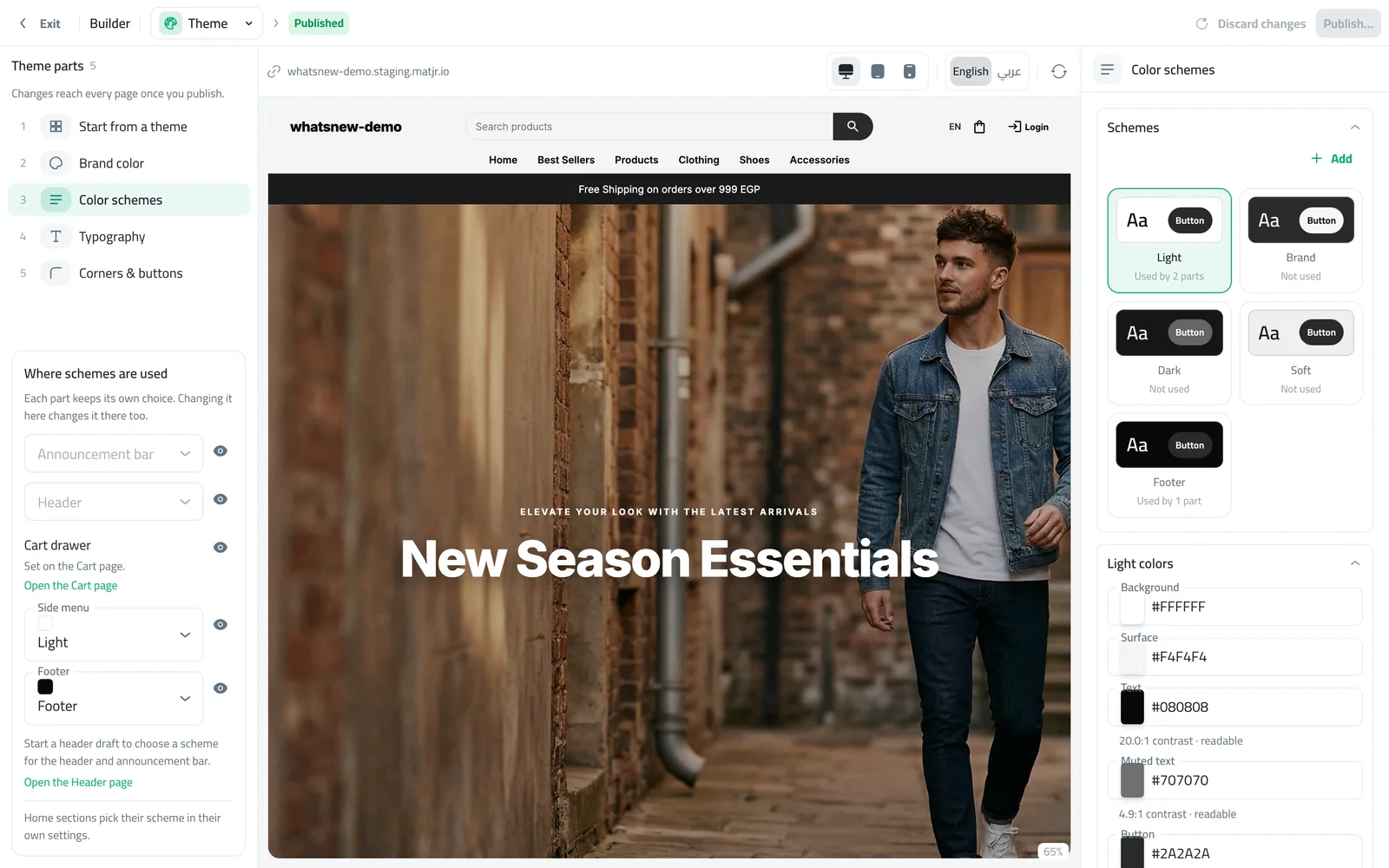
Finish with Typography and Corners & buttons. Rounded corners feel friendly, square corners feel formal. Pick one and keep it.
Build your home page with sections
The home page is made of sections stacked from top to bottom. Click Add section to add one, drag sections in the list to reorder them, and click a section to edit it. Each section has several looks under Style, and its own spacing above and below.
Click Add section and choose a type, such as Hero, Products, Categories or Flash Sale.
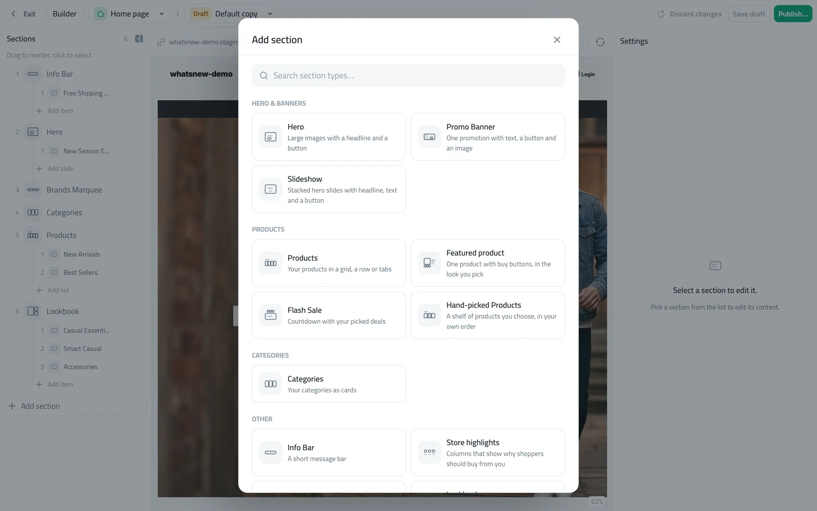
Click the section in the list, choose a look and fill in the content. Until you add your own photos, the preview shows samples.
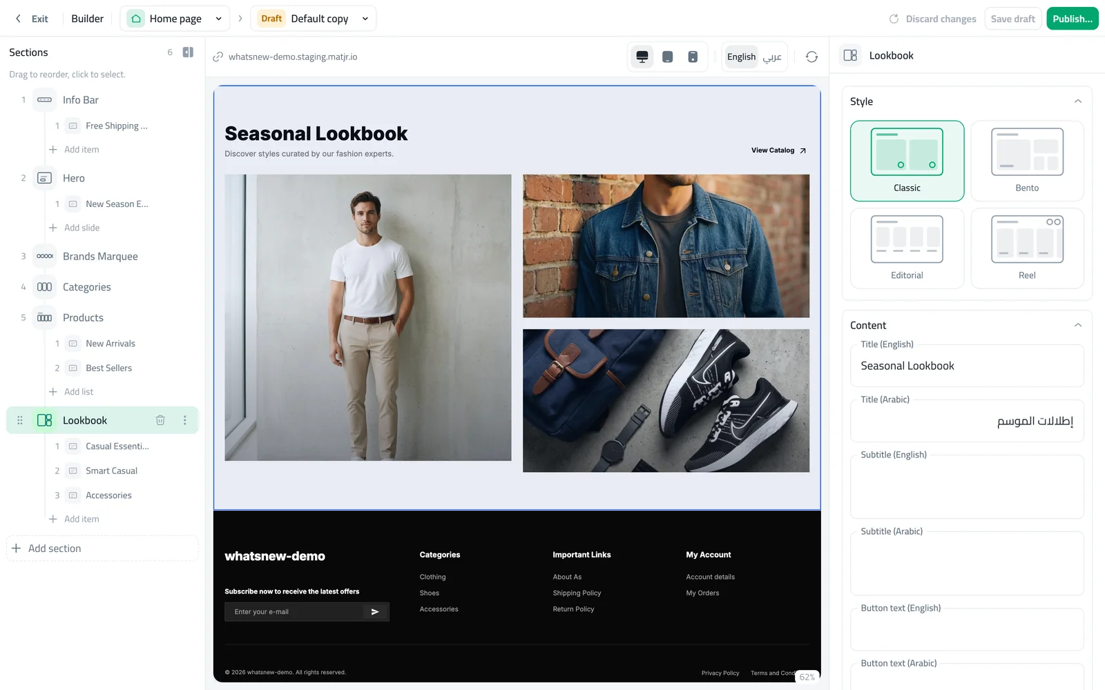
A simple order that works for most shops: a hero with your best photo, your categories, a row of best sellers, a section that shows why to buy from you, and a second product row. Add a flash sale only when you have a real offer.
Style the header, product page and cart
These pages appear on every visit, so they matter as much as the home page.
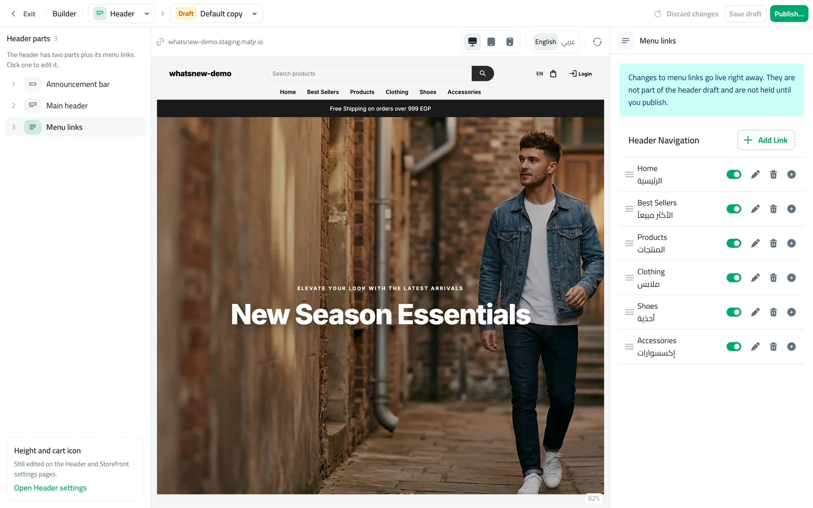
On Header, pick one of the styles. Turn on Sticky header and the Phone tab bar if most of your shoppers use phones.
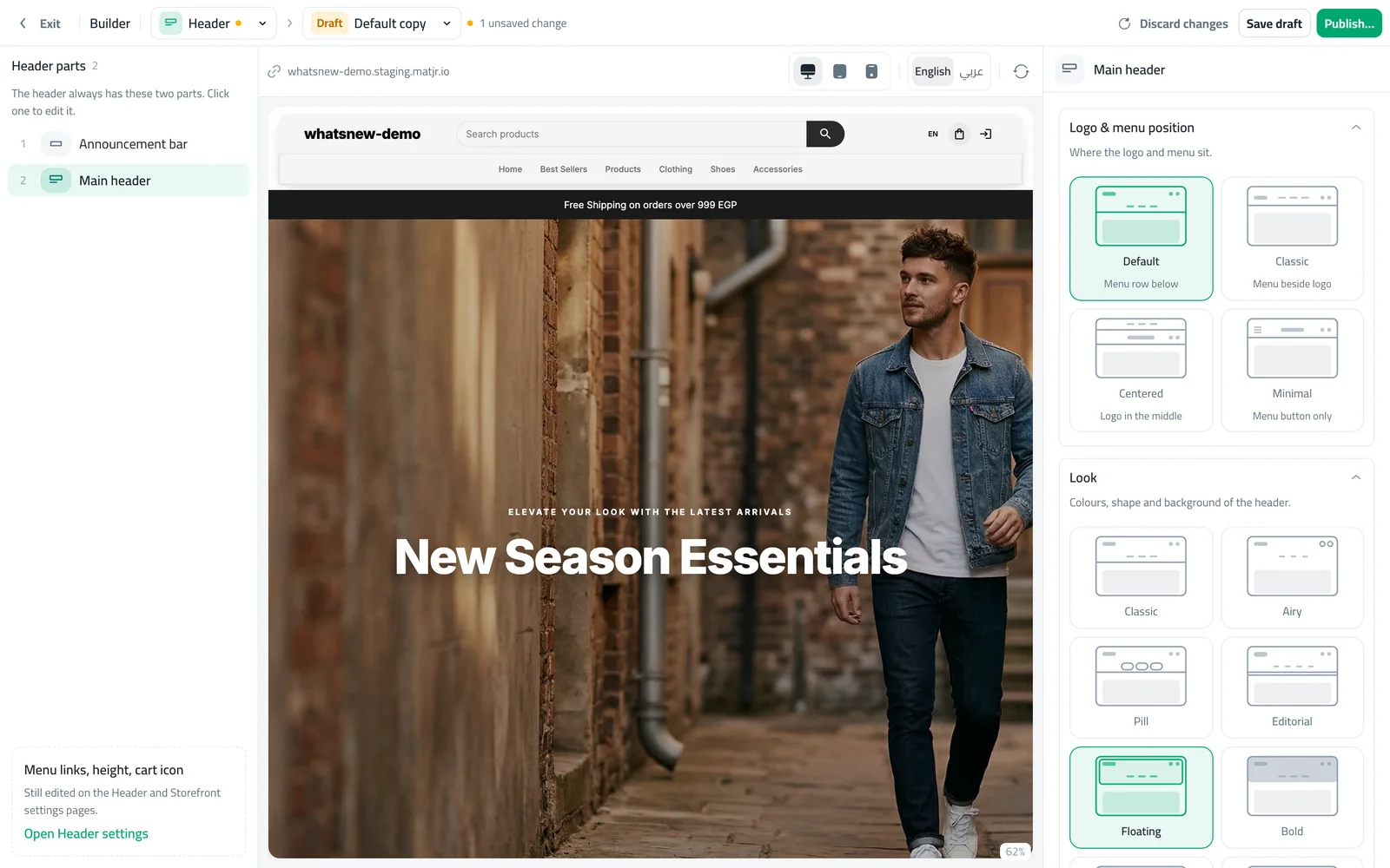
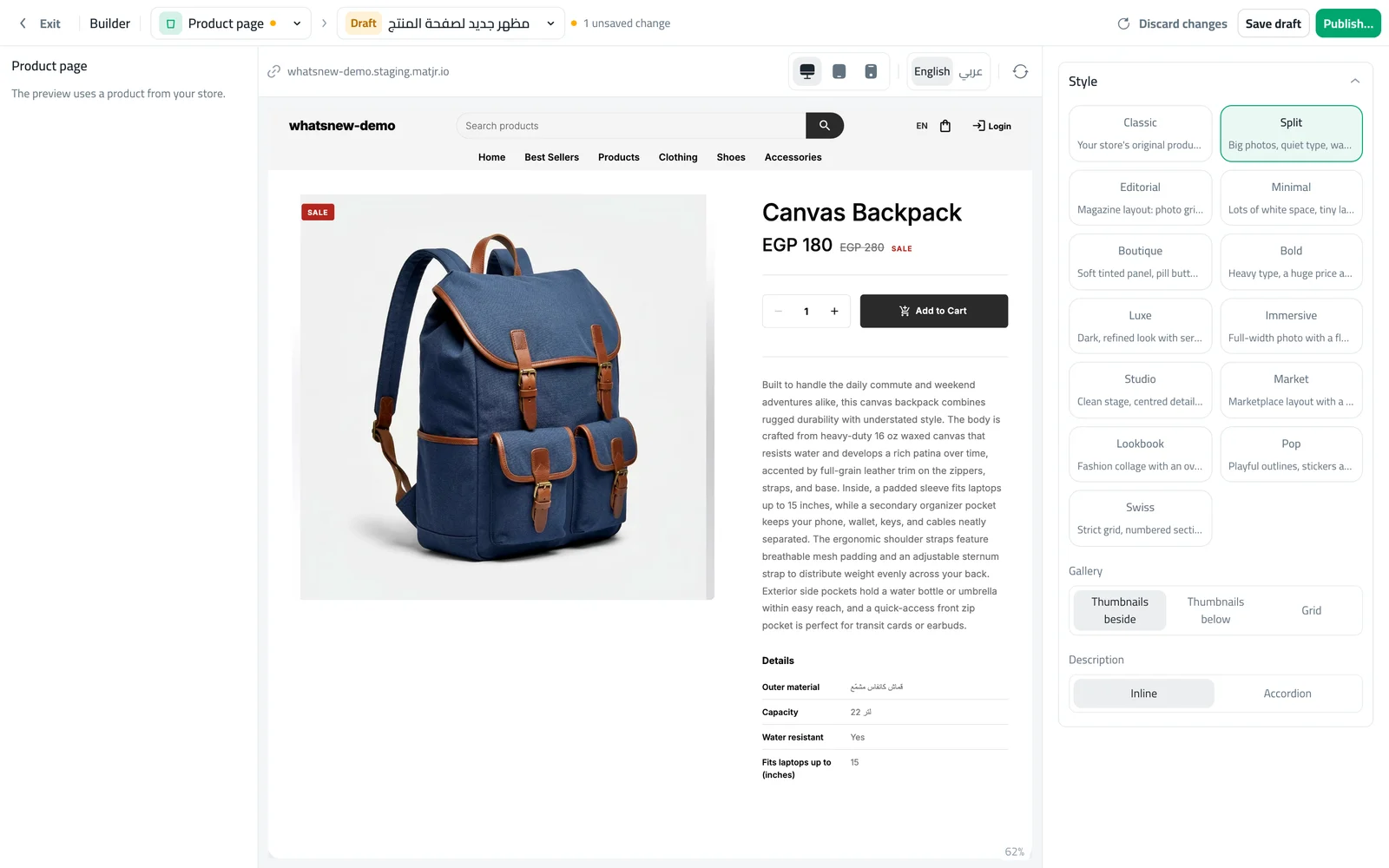
On Product page, pick a style that suits your photos. The preview uses one of your products.
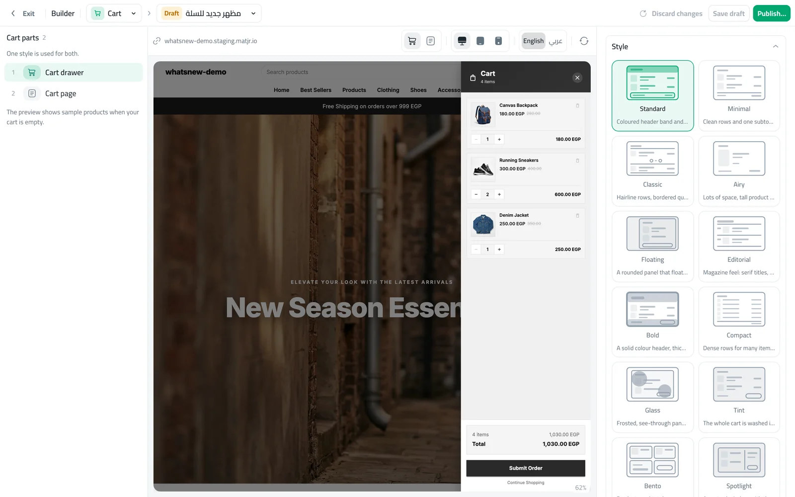
On Cart, pick a style for the cart drawer and cart page, and choose where the order summary sits.
Preview, then publish
Use the buttons above the preview to check the computer, tablet and phone views, and switch the preview between English and Arabic. Drafts save on their own, so you can stop and come back. When a page looks right, click Publish. Only that page changes in your store.
Write text that sells
Design is not only colours and photos. The words in each section guide shoppers. Keep headlines short, under eight words, and say what the shopper gets: "New summer dresses" works better than "Welcome to our store". Use the button text to say what happens next, such as "Shop dresses" or "See the offer". Write the Arabic text yourself instead of translating word by word, so it reads naturally.
Keep your store fresh
A store that changes with the seasons feels alive. Every few weeks, start a new draft of your home page, swap the hero photo, move your newest products up and remove offers that ended. Because you work in a draft, you can prepare the next season's look days before and publish it in one click.
Common mistakes
- Too many colours. Stick to your schemes instead of a new colour for each section.
- Checking on a computer only. Most shoppers are on phones. Always check the phone preview.
- Forgetting the second language. Fill in both the English and Arabic text for each section.
- A very long home page. Six to eight sections is usually enough.
Related tasks
Run an offer with a countdown: how to run a flash sale on your online store. Show product details such as material or size: how to add product specifications. See what the builder can do in Design your store and see every change before shoppers do.
Frequently asked questions
Do I need design skills to design my online store?
No. Every section comes with ready looks. You pick a look, add your photos and text, and check the preview.
Will shoppers see my store while I am still designing?
They see your current live store. Your changes stay in a draft until you publish.
Which page should I design first?
Start with the Theme, so your colours and fonts are set, then the home page, header, product page and cart.
Can I undo a design I published?
Yes. Each page keeps its versions. Open the older version and publish it again.
Try it on your own store
Start your free trial. No credit card required.