Store design
How to design your products page in your online store
How to design your products page: pick a card style, set cards per row, add filters and see how your category pages look.
- Where
- Design › Builder › Products page
- Time
- About 5 minutes
- Goes live
- When you press Publish
Learning how to design your products page is one of the quickest ways to make your store look like your brand. The products page is where shoppers browse everything you sell, so a clear card style, the right number of cards in a row and useful filters make them find and buy faster. This guide shows every step in the builder.
Before you start
Check that your products have good photos and clear names, because the cards are built from them. Decide whether you sell a few products or hundreds. A small store looks best with big cards and no filters. A large store needs filters so shoppers can narrow the list. It also helps to know which phones your shoppers use: most browse on a phone, so look at the phone preview first.
How to design your products page
Open the dashboard, go to Storefront Design, open the builder and choose Products page.
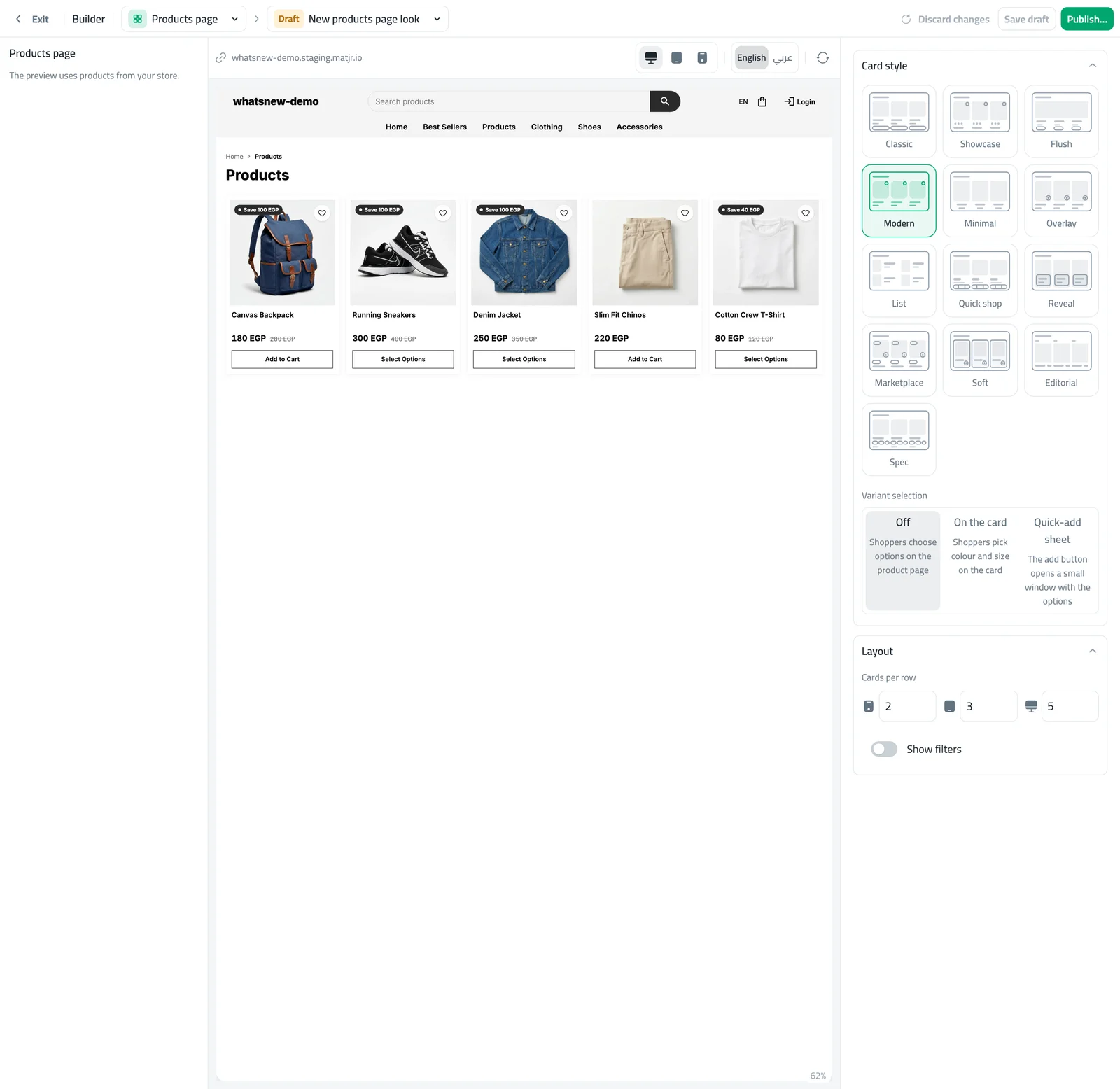
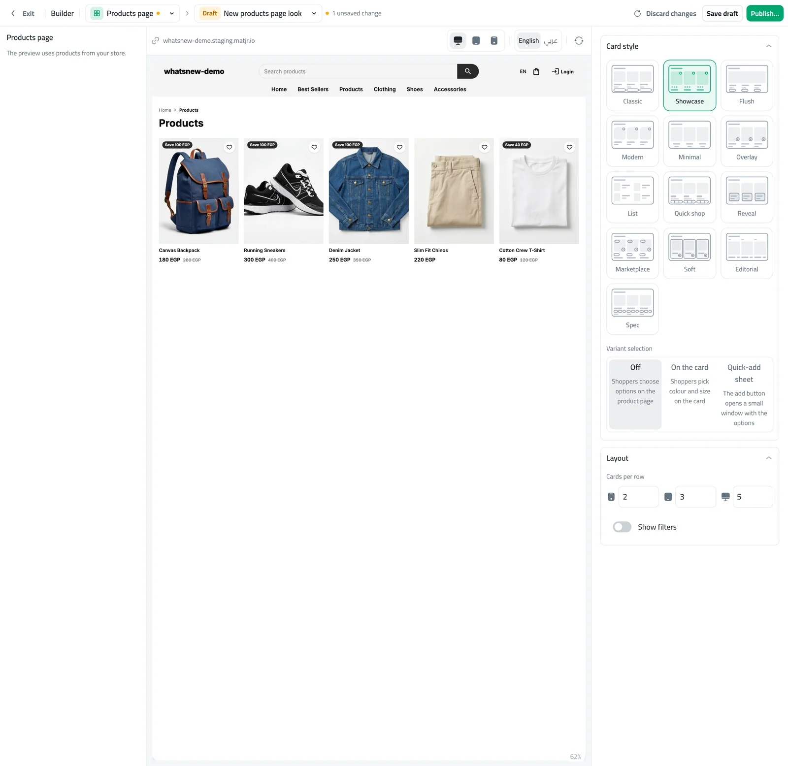
Under Card style, press the style you like. There are 13, from clean and simple to bold and photo-first. The preview shows your own products straight away.
Under Layout, set Cards per row for phone, tablet and computer. Two on a phone, three on a tablet and four or five on a computer works for most stores.
Check a category in your store to see how the same design looks there, then press Publish when you are happy.
Choosing a card style
Classic and Modern show the price and an add button on every card, so they suit most stores. Showcase and Flush put the photo first and keep the text small, which works well for fashion and decor. List shows one product per line with more detail, which suits stores with long names. Quick shop and Reveal show the buy button only when needed, to keep the page calm. Minimal removes the button completely, so shoppers open the product to buy. Try three or four styles in the preview before you decide.
Filters and cards per row
The Show filters switch adds a panel where shoppers narrow products by the filters you created, such as size, price or material. Switch it on when you have more than about twenty products. More cards per row show more products at once, but smaller photos. On a phone, two cards per row is the best balance between a clear photo and fewer scrolls.
Category pages
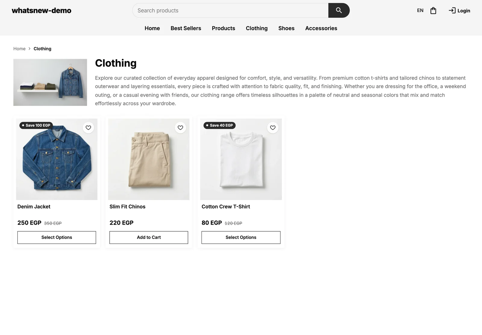
Every category now has its own page with its photo, its description, a trail back to Home and buttons for its sub-categories. The products on it use the same card style you chose here. Write a short, friendly description for each category and add a photo, because shoppers and search engines both read them. Categories you have switched off do not get a page.
Draft and publish
Everything you change is saved in a draft. Shoppers keep seeing the live page until you press Publish. If you do not like a result, discard the changes, or go back to an earlier version from the version menu at the top.
Common mistakes
- Choosing a style without checking the phone preview. Most shoppers see it on a phone.
- Turning filters on when you have only a few products. It makes the page look empty.
- Forgetting to publish, then wondering why the store did not change.
- Looking for card style in Storefront settings. It now lives in the builder.
Examples that work
A fashion store with fifty products often does well with Showcase, four cards per row on a computer, two on a phone and filters for size and colour. A store with ten products can use Modern or Classic with three cards per row and no filters, so the page feels full and calm. A store with long product names, such as electronics, usually reads better in List. Whatever you pick, look at the preview in both languages if your store has them.
Related tasks
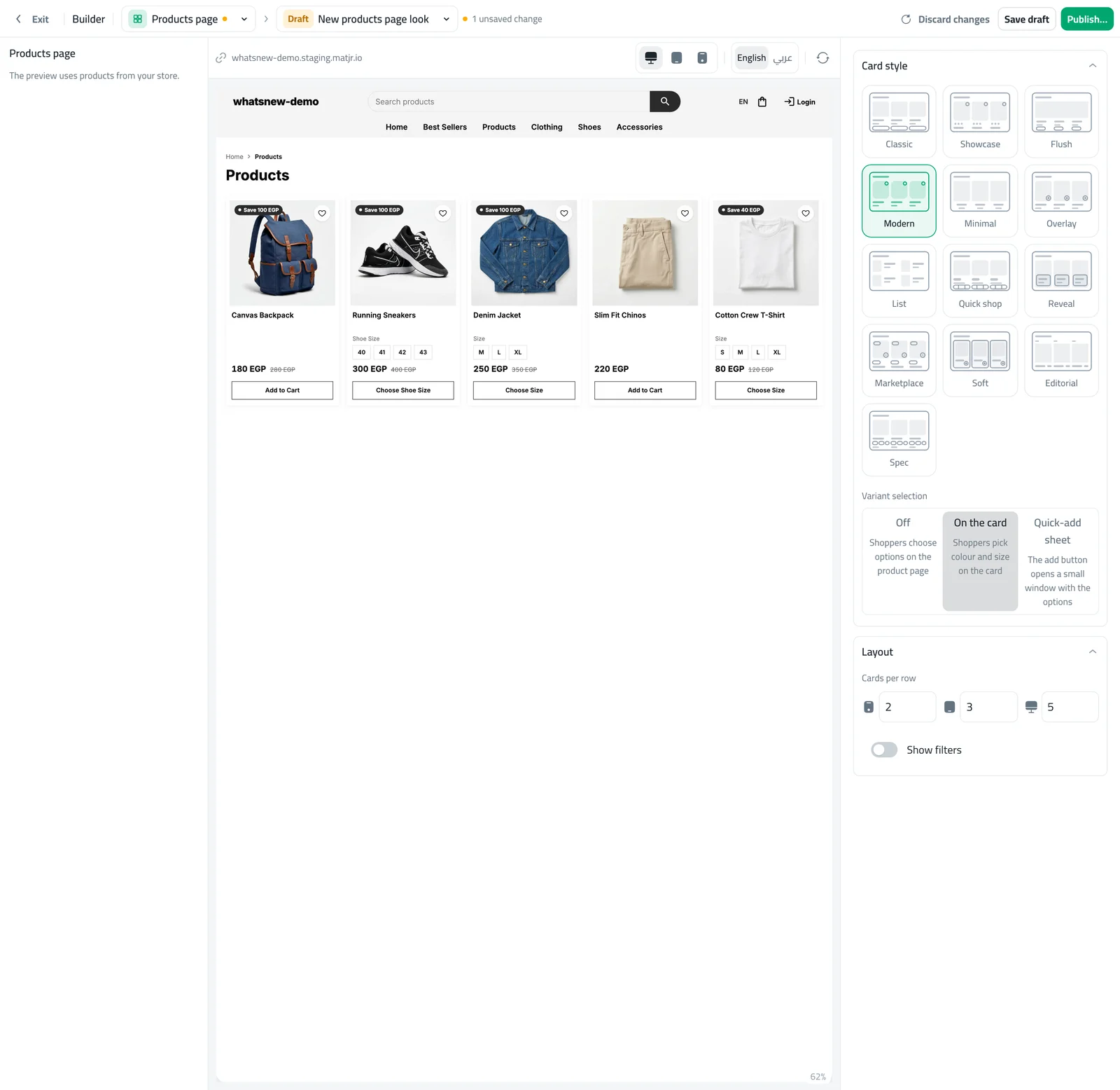
Make the cards even more useful with options on the card: read how to let shoppers choose options on product cards. For the rest of your store, see how to design your online store with the builder, and learn about adding product specifications. You can also read what is new in design your products page in the builder.
Frequently asked questions
How many card styles can I choose from?
There are 13 card styles. Try a few in the preview before you decide.
How many cards per row is best?
Two on a phone, three on a tablet and four or five on a computer works for most stores.
When should I turn on filters?
When you have more than about twenty products, so shoppers can narrow the list.
Do shoppers see my changes straight away?
No. They see them after you press Publish.
Try it on your own store
Start your free trial. No credit card required.